

Most advice about visual content on X is about ideas. This one is about mechanics, because ideas are not usually the bottleneck. The bottleneck is that your image got cropped, or the four tiles went up in the wrong order, or you spent 40 minutes on something that took ten seconds to scroll past.
What actually gets looked at
A timeline is a cropped preview of your image at thumbnail size, moving past at speed. That single fact explains most of what works.
It follows that:
- Edges are unreliable. The preview crops. Keep anything that matters away from the borders.
- Text has to be big or absent. Small type is decoration at thumbnail size, and decoration is not a reason to stop.
- Contrast does the work. Two states side by side read instantly. A subtle composition reads as nothing.
- The image has to work without the caption. Most people see the picture first and read second, if at all.
None of this is about taste. It is about what survives being 300 pixels wide for half a second.
X image sizes that matter
You do not need a chart of every dimension. You need two.
| Post type | Aim for | Why |
|---|---|---|
| Single landscape image | 16:9, around 1600x900 | The shape the timeline is built around |
| Tiles and grids | 1080x1080 per tile | Square survives cropping on both desktop and mobile |
| Source for a 2x2 split | 2160x2160 | Splits into four exact 1080x1080 tiles |
| Screenshots | PNG, any size, no JPG | JPG puts visible fuzz around text and UI edges |
That last row costs people more than they realize. A screenshot saved as JPG looks fine on your monitor and blotchy in a feed, because JPG compression is built for photographs and falls apart on hard edges. MDN's guide to image file types explains why, if you want the detail.
How to post multiple images on X
You can attach four images to a single post. Attached together, they render as a 2x2 preview, which is the whole basis of the split image format.
To post one picture as four tiles:
Start from a square source
2160x2160.
Split it into a 2x2 grid
Tap the Post (X) is the Image Splitter locked to this preset, and it shows the posting order on screen.
Attach all four tiles to one post, in filename order
X fills top left, top right, bottom left, bottom right.
Do not explain it in the caption
If the caption gives away the reveal, there is nothing left to tap for.
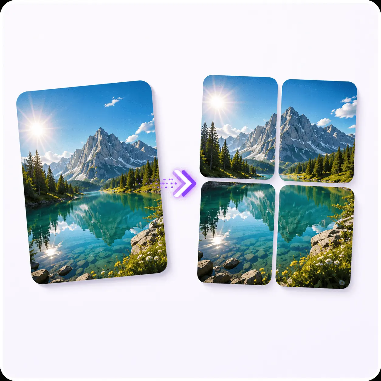
Tap the Post (X)
The splitter locked to the 2x2 grid X wants, with the attach order on screen.
The four formats worth repeating
You need fewer formats than you think. These four cover most of what performs:
Before and after. The most reliable comparison there is. Works as a 2x2 or a side by side merge.
This or that. Two options, one frame. Invites a reply, which is the cheapest engagement there is to earn.
The four tile reveal. One image split into a 2x2 where the preview crop hides the payoff. Works when the payoff is genuinely worth a tap.
The comparison board. Four related images merged into one, for showing a set: four product angles, four thumbnails you are analyzing, four versions of a design. The Image Merger does this in one step.
Pick two. Run them for a month. That is enough to learn something, which weekly format-hopping never is.
A posting loop you can keep
The loop matters more than any individual post:
Pick the format before the idea
An empty format is much easier to fill than a blank canvas.
Make the image in under two minutes
If it takes longer, the format is too complicated to sustain.
Post at a time you will actually be around to reply
Replies in the first hour are worth more of your attention than the image was.
Write down what happened
One line. Format, topic, rough result.
Repeat the format, change the topic
Not the other way around.
Step four is the one everyone skips, and skipping it means month two is a guess just like month one.
Reading what happened without a dashboard
You do not need analytics software for this. You need to be able to answer one question after four weeks: which of my two formats does better for my audience?
Compare like with like. A before and after about your product and a before and after about your industry are comparable. A four tile reveal and a text post are not.
Watch replies more than likes. A like is a reflex. A reply is someone who stopped, read, and had a thought, and it is a much better signal about whether the format is doing its job.
Be suspicious of a single outlier. One post doing well is usually about the topic, or the time, or luck. A format doing consistently better over ten posts is a real finding.
Mistakes that quietly cost reach
- Text near the edges. The crop eats it, and you never see it happen.
- Four tiles posted separately instead of attached to one post. That is four posts, not a grid.
- JPG screenshots. Fuzzy text, every time. web.dev's format decision tree takes about a minute to read and saves you from this one permanently.
- A non-square source split into a square grid. Rectangular tiles get cropped twice.
- Switching formats every week. You gather no signal and start over each time.
- Posting the grid and leaving. The replies are where the second wave of reach comes from.
What Piknova covers, and what it does not
So you know when this site is useful and when it is not.
Live today:
- Image Splitter: one image into 4 tiles as a grid, rows, or columns, with numbered output
- Tap the Post (X): the same engine on X's 2x2 preset, with posting order shown
- Image Merger: any number of images into one grid, row, column or collage
- YouTube Thumbnail Downloader: thumbnails at up to 1280x720, no account needed
Dated, not built yet: PNG and JPG converters in August 2026, then compress, resize, and batch resize in September 2026.
Never: background removal, screenshot editing, video editing.
So if your bottleneck is resizing a folder of images to a spec, this site cannot help you yet. If it is cutting one image into four tiles without opening anything, that takes about twenty seconds.
Frequently asked questions
How many images can you post on X at once?
Four. Attach all four to a single post and they render as a 2x2 preview, which is what makes the split format work.
What is the best image size for X posts?
Square at 1080x1080 for tiles and grids, 16:9 for a single landscape image. Square is safer because it survives the feed crop on both desktop and mobile.
How do I post four images as one picture on X?
Split a square source into a 2x2 grid, then attach all four tiles to one post in filename order. X fills top left, top right, bottom left, bottom right.
How often should I post visually on X to grow?
Often enough to learn something: a few times a week for at least a month on the same format. Switching weekly means you never gather enough signal.
Do I need a design tool to post good visuals?
Not for splits, grids, and comparisons. A design tool earns its place for original artwork, not for cutting one image into four.
Why does my image look cropped in the timeline?
Because the timeline shows a cropped preview, not the whole image. Keep anything important away from the edges.


